I’ve written previously about how to have more effective meetings, touching on how to frame agency presentations to be more prospect-oriented. But until now, I haven’t addressed the technical aspects and detailed content of agency capabilities decks. It’s overdue.

Having had my share of headaches with capabilities decks, I’m sensitive to the prospect’s experience of being on the receiving end of these files. Some of the decks I’ve been sent are just beasts. To give one example, I recently reviewed a 60-slide capabilities deck that cost me hours trying to change one of the obscure designer fonts into something I could print legibly. I printed and saved it in multiple ways that continued to present the header font in what may as well have been Wingdings. An agency prospect would have given up in under five minutes.
TIP: People often want to print out a hard copy of presentation slides, so sending a deck that is impossible to print is a recipe for frustration. Be sure to test your deck outside of your agency before risking a new business opportunity over it.
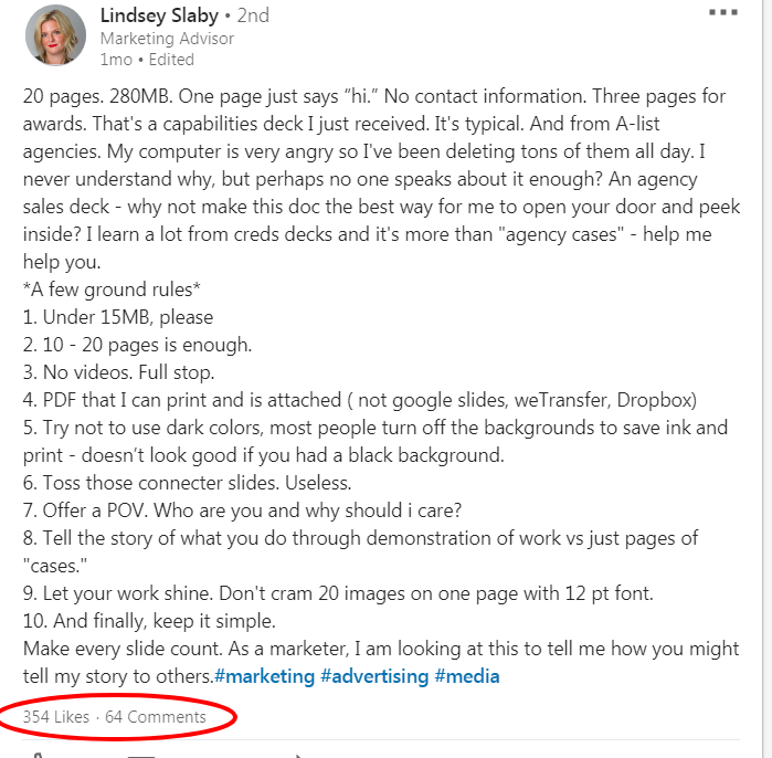
Earlier this year, Lindsey Slaby, Founder of Sunday Dinner, took to LinkedIn to vent about the capabilities decks she typically receives and offered some solid “ground rules” for agencies to observe when creating their decks.
They include (paraphrased):
- Files shouldn’t exceed 15MB
- No videos
- 10-20 slides should be enough
- Make every slide count (so, toss the useless “connector slides”)
- Keep it printer-friendly; send printable pdf files and avoid dark backgrounds
I instantly related to her post, and I’m not the only one:

Over 350 people responded to Lindsey’s post — probably because most of us are guilty of creating bad presentations, and nobody enjoys sitting through them. Ironically, I believe agencies do put significant effort into making them better, but “better” from a design / creative perspective isn’t necessarily better from a functional, UX, or new business perspective.
Is a capabilities deck the best solution?
People aren’t shy about declaring their disdain for capabilities decks. They have been described as “the worst,” “sucking,” “for losers,” “dreaded,” “tyrannical,” and “reviled.” Let it be known — I’m not a fan of them either. But we don’t talk enough about what exactly makes them so bad. So, despite the best intentions and efforts, bad capabilities decks live on, to everyone’s detriment.
Walkwest made a list of five reasons why you should ditch your capabilities deck altogether, including that they limit how clients perceive you, they are always out of date, and relying on them is lazy. Guess what? They aren’t wrong! Those are all valid points. Other valid criticisms of capabilities decks are that the static format (Powerpoint, or Keynote, etc.) is inherently boring, and “...just isn’t collaborative.” Unfortunately, you still probably need to maintain a capabilities deck anyway. Though it would be wise to keep these inherent shortcomings in mind so you can offset them as much as possible.
More importantly, think about how you can dial back your reliance on the capabilities deck (and slide decks in general). Showing your deck should not be your agency’s go-to approach. It is not always the best or most appropriate option. If you have a “default” or “master” capabilities deck, it can be tempting to rely on what you have ready to go, but a pre-made capabilities deck is the antithesis of custom creative solutions and will cost you valuable opportunities. Your “default capabilities deck” should merely be a common starting point for dozens of different custom iterations.

Are you approaching your capabilities deck with the right sense of purpose?
This may be perceived as blasphemous among creatives, but your deck need not center on cutting-edge creative, much less custom creative ideas. Your prospects have already seen your work on your website and were interested enough to proceed to a meeting. They’ve already seen your team’s bios and your agency’s awards and are enthusiastic enough to be curious about what you might do for them.
Your capabilities deck should be about your effectiveness at delivering future creative solutions that will address the prospect’s unique challenges. Those solutions may be suggested and explored elsewhere, in the same or a future meeting, via methods other than your slide deck.
Features of a good deck and presentation:
- Provides an agency overview, with each part custom crafted to align with the opportunity
- Makes connections that clarify and demonstrate understanding
- Informative
- Collaborative and interactive (break away from the deck to do this)
- Demonstrate agency culture, approach, and expertise in the context of providing solutions to prospect challenges
- Wow with relevant results and bottom-line outcomes
Features of a flawed deck and presentation:
- Showing off the agency, particularly in a redundant manner (“look at us; me, me, me”)
- Noise (too many words, too much stuff)
- Try to wow with creative glitter and sizzle (shallow, not tied to results)
- Disconnect
- Monologue
- A test of endurance
- Low relevance
- One-size-fits-all
- Repetitive
- Hard to follow; hard to read
- The point of the slide or overall deck is unclear
- Includes unnecessary information easily available elsewhere
- Delivered like a pre-recorded program from start to finish

What are some other tips to keep in mind for a capabilities deck?
- Don’t become so consumed with the preparation and delivery of your capabilities deck that you forget to focus on the prospect. Focusing on your deck is agency-centric and that will cost you opportunities. Instead, listen, engage, question, and present relevant information, examples, and solutions to the prospect’s challenges. That overarching goal and process must always come before your slide deck.
- We advise clients not to send capabilities decks via email (ever) because it is ineffective for new business and can work against you. You definitely don’t want to send a presentation via email if the prospect is not interested enough to make time to talk through it with you during an in-person or virtual meeting. If they won’t make time for that, there is no real opportunity there. On the other hand, some think it’s fine to send your capabilities deck when following up on an in-person or virtual meeting where the deck was already presented. If you do this, Forbes Agency Council suggests creating a second version of your deck. You would present from your first version, which should include very little copy and rely on your verbal explanations (and perhaps hand-outs with supporting documentation) as you walk through the slides. You would use the second version to hand out afterward or send as a follow-up. The second version should have enough additional detail to stand on its own if shared with others who may have missed the in-person presentation.
- Use standard fonts. Embedding can help with non-standard fonts, but that also increases the file size and can slow the presentation down. (Hubspot recommends big, bold, sans-serif fonts on a high-contrast background that can be easily seen at the back of the room).
- Tell a story and use your capabilities deck to provide visual elements in support of that story. Your slide deck should be on a track that is parallel and complementary to your presentation — not a duplicative, concurrent version of your presentation. (Hubspot explains the science behind why this approach keeps people more engaged and helps them better retain information here).
- Take a super minimalistic approach to copy. Include only what is necessary, avoiding too many words (especially buzzwords!) and too many bullets.
- Clearly connect the information on each slide to your bigger picture.
- Go back to the RFP and what you know about the prospect and their needs based on your strategic questioning, and make sure that each element of your deck is in service of how your agency can solve their specific challenges.
- Assume that people will want to print your presentation and make it print-friendly.
Conclusion
It’s probably not news to you that most agency capabilities decks are problematic. You may be aware that your agency’s capabilities deck is flawed, too. The real challenge is understanding how best to fix it. A capabilities deck should be evaluated for new business strategy first; next for functionality and user experience; and finally, for design consistency and creative elements. This is probably the reverse of how many agencies approach them. When you re-evaluate your agency’s approach to the purpose, creation, customization, and delivery of your capabilities deck, you will see a positive impact on your agency’s new business outcomes.
Do you have any insights or stories to share about your experience with capabilities decks? Let us know in the comments or on social.
Read more:
- Why Your New Business Meetings Rarely Turn Into Actual Business
- How to Have More Effective Conversations With Agency Prospects
- 6 Ways Agencies Botch Prospect Meetings
Image credits: agency capabilities deck © Adobe Stock / Monkey Business; agency capes deck © Adobe Stock / vectorfusionart; bad capabilities presentation © Adobe Stock / aerogondo


