The About Us page is typically the second most visited page on a website — after the homepage — making it a high priority for agency new business purposes. No matter where you connect with your next agency client, whether at a conference, by referral, via email, LinkedIn, or cold calling, they will always end up at your website. By ensuring that your website’s About Us page works for you rather than against you, you can make the work of securing agency new business much easier.

About Us page missteps
There are great About Us pages, and then there are others that are just...not. Jami Oetting (of Hubspot) studied hundreds of agency websites and identified some common errors with agency About Us pages. These include providing too many irrelevant details, not writing with a target audience in mind, and using confusing copy. All of these speak to a problem with copy strategy and execution, as well as failure to lay a strategic sales foundation.
How can you avoid those problems? If you have done the work to identify your ideal clients and the qualities that set your agency apart in a strong positioning statement, then it is much easier to reflect that consistently and concisely throughout your website copy.
There are other missteps I frequently see on agency About Us pages. For example, I see a lot of broad, sweeping statements that are both vague and generic. Because they aren’t unique or specific, they don’t come across as authentic and fail to build trust for visitors. Sometimes the agency hasn’t done the work to get at the core of their positioning and they don’t really know who they are. Or they are afraid to risk losing any opportunities so they don’t want to stake a claim as to who they are because it might be limiting. Either way, they end up coming across as trying to be all things to everyone. It’s the “I’ll be whoever you want me to be” phenomenon, which doesn’t leave them room to be anything at all, because they’ve defined their agency above all else as malleable. Like a lump of clay.

By far, the biggest faux pas I see with agency About Us pages is when they’ve been omitted altogether. It’s a real missed opportunity to sell the agency and show off what it can do. When there is no About Us page, it always makes me wonder what could be so bad about the agency that would make them decide it's best not to say anything about themselves at all?
What are people looking for on About Us pages?
To create a strong agency About Us page, go back to your target prospect profile(s) so you know who you are writing to. Then consider the type of information visitors will be looking for when they come to your page. What questions are they trying to answer?
For example:
- What exactly do you do? (More specifically, are you experienced at serving businesses like theirs, solving challenges like theirs?)
- Are you credible and trustworthy, with a proven track record?
- How well-qualified is your team?
- Do you seem like people they’d want to work with?
- What drives your agency; what is your reason for being?
- How are you different or better for them than the next agency?
Consider whether you are answering all or most of those questions adequately on your About Us page and if you are doing so in a way that expresses your agency’s unique personality, via a visually clean, easily scannable layout.
Note: Your About Us page will probably attract people interested in working for your agency as well, but that is not our focus here. That can be easily addressed by adding a call to action directing potential applicants to another page written specifically for them.
Recommendations for About Us pages
There are many different approaches to About Us pages and there is some flexibility around what you might include to be effective with yours. For example, G2Crowd asked twelve experts about how to write a compelling About Us page and got twelve different answers. Those differences extend to the specific elements you might include on your page, such as a timeline, and also to your overall approach and what the page should convey. The beauty of it is that leaves a lot of room for creative interpretation; this is not a cookie-cutter situation. We can point to many agencies that have taken different paths to creating effective About Us pages.
Here are some ideas to consider incorporating into your About Us page:
- Use pictures and videos of your team (not stock photos)
- Demonstrate personality
- Be authentic
- List your agency’s awards
- Include what clients have to say about working with you
- Display client logos
- Pull out key performance metrics to draw attention to them
- Keep copy concise
- Write copy to address customer concerns and motivations
- Use a personal voice rather than formal corporate-speak
- Use a clean, simple layout that is easy to read
- Consider incorporating graphic elements such as a timeline
- Include a call to action for them to take the next step
- Offer an option for them to stay in touch, such as via a blog or eNewsletter subscription
- Link to case studies and other proof of work where appropriate
Should you include all of your agency team members?
Many agencies have concerns about whether to showcase their entire team or just the key leaders — and the ones who struggle with it the most are the smaller agencies. Either strategy can be effective, provided you share enough information to inspire confidence in your capabilities and make prospects want to know you better.
What I don’t recommend is excluding all individual bios and pictures completely. That undermines your effectiveness at building trust and showing off your agency’s personality. Omitting all team members won’t make your agency look bigger or smaller as much it will leave prospects not knowing how well-qualified and talented your team is. Brands deliberately choose small to mid-size agencies and often prefer them over large agencies, so whatever the size of your agency, why not embrace it, play to your strengths, and be authentic?

Karl Sakas suggests most independent agencies should include their whole roster on their site because it supports transparency and humanizes the team. He also points out that when an agency omits its team members altogether, it implies they may have something to hide. I’m inclined to agree. When an agency doesn’t show any employees on its website, it doesn’t reflect favorably on them. If you are confident in your team members you should show them off as ambassadors and experts for your agency.
Note: One thing that I notice on About Us pages right off the bat is an agency’s diversity. I’ve written about agency diversity and culture previously and it’s only becoming more important for agency new business. If you have a page of team members’ pictures and there are no women in your leadership roles or no persons of color or people over age 40 — just to give a few examples — be aware that a prospect may notice that more than you do and may assign greater importance to it than you do, and it may be a disqualifying factor for your agency. So take a minute to give a critical eye to your lineup and determine whether there is an issue you need to address.
What are agencies doing right on their About Us pages?
Here are a few examples of agency About Us pages I’ve found interesting and that may spark some inspiration for you:
NTARA:
Why I included it:
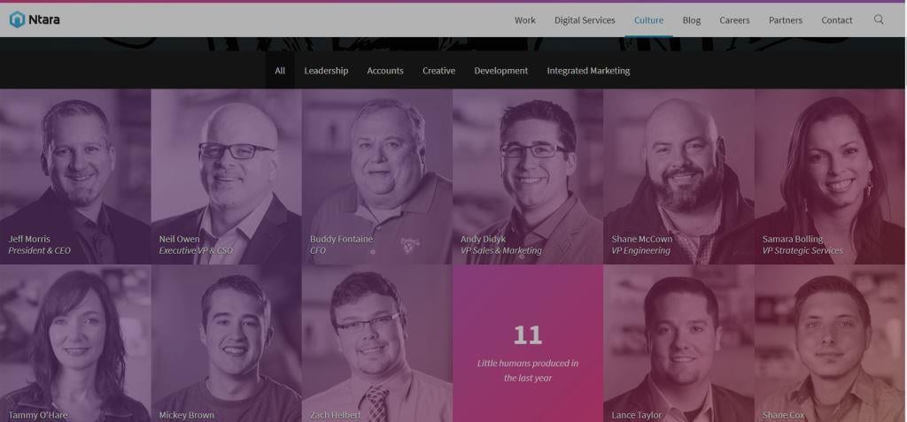
I like this team page because every time you reload it, it reshuffles the pictures. Only the top row stays static because those are the key leadership roles. It’s visually interesting and suggests a less hierarchical culture, which is consistent with their “no-pretense,” “no-ego” description of themselves. You can also click to sort the team members by function: leadership, accounts, creative, development, and integrated marketing. A welcome departure from the typical team page. Nicely done, Ntara.
Why I included it:
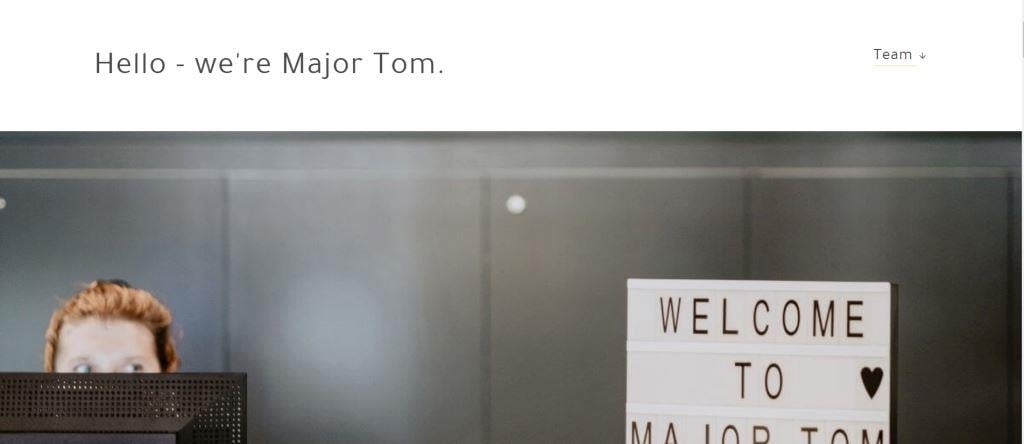
Major Tom’s About Us page exemplifies a very clean visual layout, with a variety of graphic elements and just enough copy and images to give the visitor a sense of their personality and confidence in their abilities. It specifically states who they are interested in working with and there is just enough detail given to inspire a prospect to reach out and learn more, but not so much that it’s overwhelming. If you visit Major Tom’s site, don’t forget to check out their homepage, which deserves attention in its own right.
Why I included it:
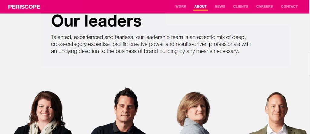
Periscope’s About Us page, like Major Tom’s, is well-designed and visually-consistent with their agency brand. It includes just enough information via copy, video, and graphics to grab someone’s interest. The copy is written to resonate emotionally with prospects, perfectly explaining their “why.” Who is Periscope? They show you in their short video. I’m also a fan of the images and layout for their leadership profiles; it’s a departure from the standard square headshot grid layout. The “Things We Do” copy is a bit vague; it feels like a lot of agencies might say something like that, but they bring it back in with a link to “View Things We Do,” which does a much better job of explaining and showing exactly what that is. Well done.
Why I included it:
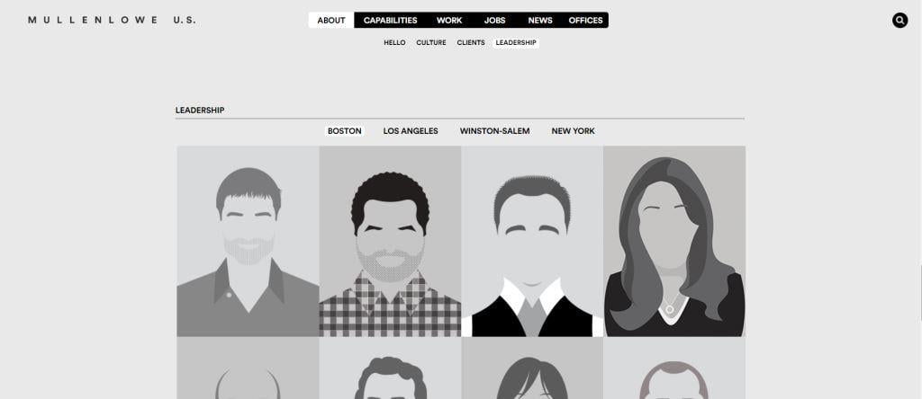
MullenLowe’s About Us page is very minimalist and simple. It has a clean layout without relying as heavily on images and graphic elements as the previous examples. It provides a list of the agency’s awards and bite-sized information about key aspects such as their culture and clients, including client logos. One of the things I really like here is their bio pictures. They’ve gone with abstract black and white illustrations to represent their team members by location, minus identifying facial features. It’s different, visually appealing, and it works for them. As a bonus, this layout de-emphasizes the diversity factor for the agency because it makes it difficult to make quick judgments about the team’s makeup when they are represented in the abstract.
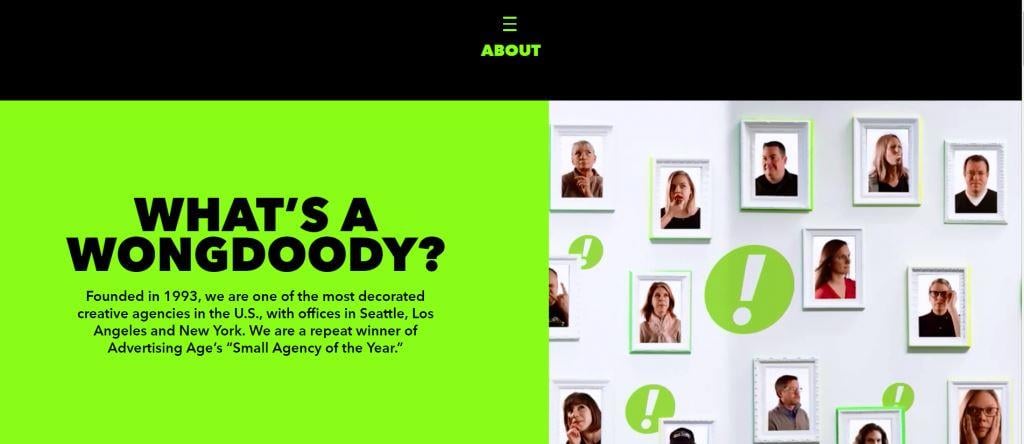
Why I included it:
WongDoody’s About Us page leads by drawing visual interest right off the bat. At the top of the page, the copy clearly explains who they are in a way that says they deserve your attention, and at the same time, they prove that with the revolving wall of framed pictures that show WongDoody team members in motion. The other information on the page is well-executed but doesn’t represent a significant departure from the expected. For me, it's the above-the-fold content here that is worth a visit.
Parting thoughts
As you can see, there is no specific “right” or “wrong” way to create your agency’s About Us page. Rather, there is a spectrum of suggested elements and approaches to craft a strong About Us page that will work to help your agency generate interest and close new business.
What can you do to make your agency’s page stronger?
Read More:
- Why You Should Consider Lead-Gen Tactics for Your Agency Website
- Agency Positioning: Is Rejecting the Traditional Agency Model Enough?
- Ad Industry Diversity: The New Business Perspective
- Why Accuracy and Authenticity Matter for Agency Positioning
Image credits: agency about us pages © AdobeStock/michaklootwijk; lump of clay © AdobeStock/dule964; agency team members © AdobeStock/Jacob Lund.

