This is a “tough love” post, and I’m going to start by ripping the bandaid off: a lot of agency websites aren’t that great. Specifically, they often perform poorly in terms of SEO and user experience (UX). As a group, agency websites (and homepages in particular) tend to be creative-heavy and short on strategy. That can undermine an agency’s new business efforts.

In fairness, the advertising industry isn’t notorious for having the “worst possible” websites (contenders for that honor in years past have included law firms, engineering businesses, and PR firms). But agencies aren’t exactly knocking it out of the park, either. Now, you might be thinking about all of the lists (largely by agencies, for agencies) celebrating the best agency websites (like this one). I’ve looked at those too. The criteria for determining “best” is anything but rigorous; often unspecified, subjective, and based on little more than the list’s author generally “liking” the design of the website’s homepage. (For example, this “best digital agency website” round-up from Econsultancy is written by someone who is admittedly “not really” an expert in web design). Those kind of standards for great website design aren’t good enough. Today, it’s not enough for your agency’s homepage to be “pretty.” And frankly, some of them aren’t even that.
Since design services, including website design, are offered by many agencies, it is arguably even more expected that their websites represent their best work. That’s essentially what Business Insider wrote in 2012, before concluding that “most agency websites are mediocre. A few are truly horrible.” Harsh, right? When I read that, honestly, my first thought was, “Finally—here’s someone who gets it!” Their write-up includes flashback screenshots from some of advertising’s finest, including TBWA, Ogilvy & Mather, Grey, and Bernstein Rein. Though these sites have probably been re-designed many times since, it doesn't mean agencies aren't making similar design mistakes today.
Why does your homepage matter for agency new business?
What’s the big deal about your agency’s homepage? Why should you care? Although people may enter your site from many different pages, the two most frequently visited pages on a website tend to be the homepage and “about us” pages (Hubspot).
No matter where you meet a prospect, they will circle back to your website to see what your agency is about and check out your latest work. If you’ve already made a good impression on someone, your website shouldn’t do anything to jeopardize that. If your agency is unknown to someone and they’ve happened upon your site, your website should quickly make a positive first impression. To do that, it must clearly provide the information visitors need as quickly as possible. Will a “pretty” page help in the service of that goal? Yes—as long as it still clearly provides the information visitors need as quickly as possible. Otherwise, what’s the point?
What is great design? What does it mean to say a site is well-designed, or even beautiful?
 In researching this post, I've come across pro-design stats such as: "First impressions are 94% design-related." That one is from a conference paper about trust for online health sites in 2004. Another one is "Judgments on website credibility are 75% based on a website’s overall aesthetics." That’s from a 2009 peer-reviewed journal article about a study done with 30 subjects viewing 13 pairs of images of recruitment agency web sites. Both of these statistics are based on old data. They have also been extrapolated to apply more broadly to design issues than is warranted based on their original, relatively limited scope. When I see websites that lean too far “artsy” at the cost of functionality, delivering creativity without context, I wonder if such stats have been taken at face value.
The takeaway is: Don’t fall for arguments that suggest it’s enough to go all-in on design aesthetic over everything else. These figures don’t seem to hold up on examination. As much as creatives may want to embrace this type of data, aesthetics alone are no longer enough. Good design today means something more.
A well-designed homepage must be:
Pretty + Functional
Website design should be: uncluttered.
Nick Babich, on Adobe Blog, argues that businesses should embrace simplicity and keep the “less is more” principle in mind to “avoid cluttering your homepage with excessive text, images, and videos.” Andy Crestodina at Orbit Media agrees, saying, “Visitors don’t like clutter. We like whitespace. In other words, we like low visual complexity.” Think Marie Kondo, but for your website.
Website design should be: intuitive.
Google conducted a study in 2012 to explore what types of websites are considered beautiful. They found that sites perceived as the most beautiful were simple and clean, while those that had more complex designs and deviated from standards were less likely to be loved. For website design, Andy Crestodina at Orbit Media translates this to mean: “it’s good to differentiate your brand, but the layout isn’t the place to do it. Be different in WHAT you say. But be typical in HOW your site is used.” Hubspot also did a survey that supports the importance of function over beauty. It found that visitors value easy-to-find information over beautiful design.
Website design should be: functional.
Christopher Butler at Newfangled has analyzed agency homepage design. According to him, the purpose of an agency homepage is to leverage its attention and then filter it appropriately based on the agency’s business goals (paraphrased). I would add that the agency’s business goals should be very visitor-centric, at least for those visitors who fit an agency’s target prospect profiles. In other words, for an agency’s homepage to function as it should, don’t make visitors work to get the information they are looking for. Design must be intuitive for visitors to flow in the appropriate directions to locate the information they seek. From a new business standpoint, part of that flow should help visitors determine whether they are or are not a good match for your agency.

Where are the greatest opportunities for agency homepages?
Here are some design considerations where we often see agencies miss the mark:
Designed with purpose.
What is the goal of your site? Does your website design support that overarching goal? This is a major area of concern from an agency new business perspective. Ideally, your site design and copy will be consistent with your sales strategy. Is it immediately clear to site visitors what you do, who do you do it for, and what results you get?
Do you know why people come to your site? I will bet that the #1 reason is not to view videos of your work. Not unless it’s accompanied by results and context about the challenges you’ve solved and how you solved them. Visitors (the ones you should care about anyway; your prospective future clients) want to know if and how you can help them. A pretty picture or eye-catching video on its own doesn’t do that.
TIP: Your website, starting with the homepage, should be designed to resonate with your agency’s target clients, not your creative colleagues. When I see an “overly creative” homepage, this is where I suspect something has been lost in translation. Creativity works well when it's strategic, simple, and contextualized.
Christopher Butler at Newfangled has written specifically about agency homepages. Here are some of his key takeaways on design and purpose:
“An agency’s homepage does not exist to excite or entertain an audience. It exists to attract, inform, and engage future clients. The best way to do this is [to address] four concepts in the following order of priority:
- What you do [positioning]
- What you’ve done [relevant results]
- What your clients say [testimonials and social proof]
- What you say [your thought leadership and expertise]”
On the question of aesthetics, or being “pretty,” versus being functional, Christopher says, “The notion that an agency can either choose good design or good marketing is, obviously, a false dichotomy.” He goes on to say it’s important to balance business purpose with personality, both being of equal importance. He notes, though, that in his experience, “an agency’s personality is often far more emphasized than its purpose.”
Website copy.
The copy on your homepage should be easy to understand and free of industry jargon. I get it—your agency is creative and clever. Just be careful that you don’t outsmart yourself by writing copy that doesn’t serve its purpose. For example, instead of using the obvious “descriptive, keyphrase-focused headlines,” Orbit Media has observed “a lot of marketers write something clever or vague instead. But clear is better than clever.” You don’t have to be extra extra.
Remember—you aren’t writing to your peers, you are writing to people who make business decisions about whether to engage your agency. Some of those people will be marketing professionals, but they may also be in procurement, finance, and other non-creative positions. The language and messaging you use should resonate with them.
TIP: Be sure your microcopy has been updated for your agency's current positioning. Do your meta descriptions position your agency differently than your homepage does?
TIP: Are you sure it’s immediately clear what your agency’s positioning statement is? Or are there multiple variations of statements made across the site that hint at what you do; circling the neighborhood of your agency’s positioning but not pinning it down precisely? This approach indicates you thought about your positioning but didn't spend quite enough time on it. Or perhaps you are hesitant to commit to putting a stake in the ground for fear of missing opportunities. In either case, this will lead to a loss of prospective new business.

Page load time.
Page load time is a HUGE one for agency homepages. It is one of the places where agencies make mistakes most frequently because they love to push the envelope on “bleeding edge” creative, embedding high-res images and large video files. But remember, creativity at the cost of functionality is not a recipe for effective design. Slow page load hurts both user experience (UX) and SEO. Google now factors slow loading pages into their search algorithm, penalizing sites that are slow to load. Mobile site speed lags far behind desktop speed, as you’ll see in the agency homepages I’ve tested below.
Pretty + Dysfunctional = Poorly Designed
In a recent study by Reboot Online, almost across the board, the agency websites they surveyed failed to perform well. They found that 70% of agency websites had a poor page speed; the average score (using Google’s Page Speed Insights Tool) was 41. For reference, Google uses a scale of 0-100, with 90-100 considered fast, 50-89 considered average, and 0-49 considered slow.
These results are particularly significant because the group of sites Reboot chose to assess was already skewed to include the best-performing sites. The 30 agencies they selected were taken from the first three pages of Google’s search engine results pages (SERPs) for the search term “digital marketing agency.” Further, it’s reasonable to expect that relative to the entire universe of creative agencies, those who are positioned as “digital marketing” specialists should be among those most well-versed in website performance.
There is no shortage of statistics on how damaging a slow-loading page is for a business. For example:
- 47% of people expect a web page to load in two seconds or less (Econsultancy, via TytonMedia).
- 40% of people will leave a website if it takes more than three seconds to load (Econsultancy, via TytonMedia).
- 39% of people will stop engaging with a website if images won’t load or take too long to load (Adobe, via TytonMedia).
- The change in a website bounce rate spikes to 100% when a page takes four seconds or more to load. It jumps to 150% if a page takes eight seconds or more to load (Mobile Joomla, via TytonMedia).
Key terms.
Does your homepage copy —especially headers— and microcopy include the key terms that prospective clients would be searching for? This is an SEO item that can hurt your overall website visibility. As the most important page on your site, it’s critical that search engines understand what your agency’s homepage is about and who it would be relevant to. That way, it will be included in appropriate user searches.
![mobile friendliness agency homepage [Converted]](https://info.duvalpartnership.com/hs-fs/hubfs/mobile%20friendliness%20agency%20homepage%20%5BConverted%5D.png?width=1960&name=mobile%20friendliness%20agency%20homepage%20%5BConverted%5D.png)
Mobile-friendliness.
Do the visual elements (graphics and videos) work well on a mobile device? Is the site easy to read and navigate on mobile? According to SAG ipl, 40 percent of people will switch to a different search result if the first one is not mobile-friendly. New visitors have no loyalty to your agency. By not providing an optimized experience for them, your agency gives visitors the impression that their visit is not important. Why should they waste their time? Additionally, mobile optimization is now a ranking factor for Google’s search results, making it even more important for agency website design.
TIP: One of the ranking elements Hubspot uses for its “best website design list” is whether the homepage design includes calls-to-action. Should your homepage include calls-to-action (CTAs)? Some agencies do, and others don't. You may feel it's not consistent with the image you want to present, or that it's not a good match for your target audience. Still, it makes sense to consider using some CTAs (and other lead-generation tactics) on your website, as I’ve explained here.
Let’s explore a few examples of agency homepages:
Nucleus Marketing Agency
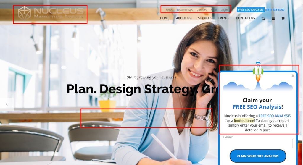
- Score from Google’s PageSpeed Insights (mobile): 8/100
- Score from Google’s PageSpeed Insights (desktop): 41/100
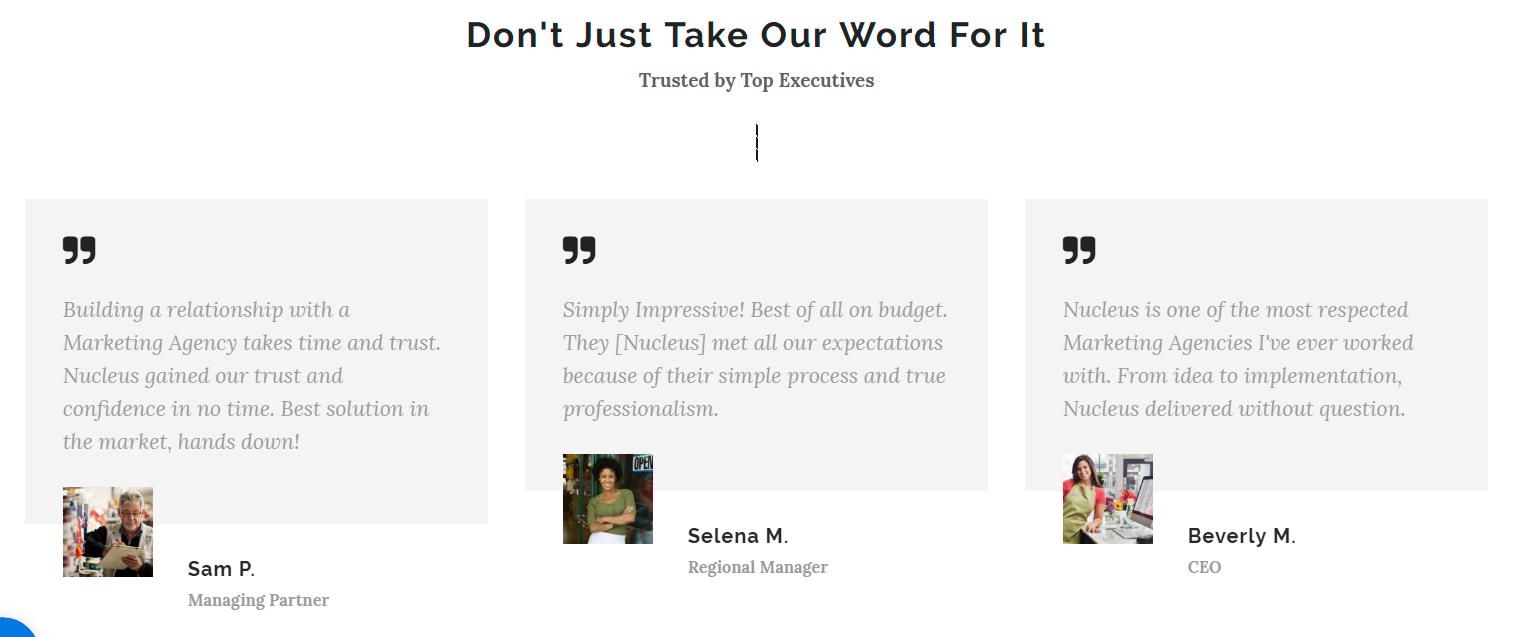
Nucleus’ homepage has three billboard image options that rotate via an arrow button. All of them appear to be stock images, which comes at the cost of agency authenticity. The chosen billboard images don’t reflect a lot of diversity. Images associated with testimonials at the bottom of the page also appear to be stock images. Combined with the absence of last names and companies, the testimonials don’t do much to build trust.
In the image above, I’ve drawn attention to some of the on-screen elements that work against this page’s effectiveness, including poor visibility of the agency’s logo, navigation, subheaders and copy. I’m not personally a fan of obtrusive pop-ups, particularly on the homepage. I understand these are sometimes effective despite being annoying, so perhaps it’s getting results for Nucleus. Just this week, though, Mark Schaefer sent out an email citing a brand new Google stat on pop-ups: “More than half of all consumers said they would not revisit or share a page that had a pop-up ad.” So, there’s that.
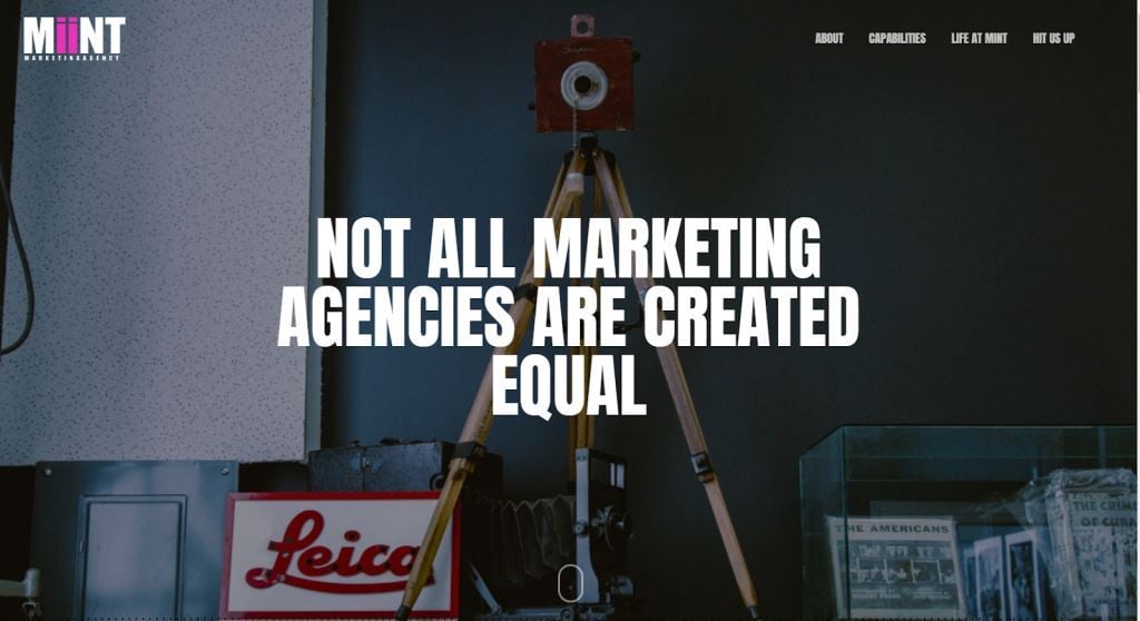
Mint Marketing Agency
- Score from Google’s PageSpeed Insights (mobile): 37/100
- Score from Google’s PageSpeed Insights (desktop): 74/100
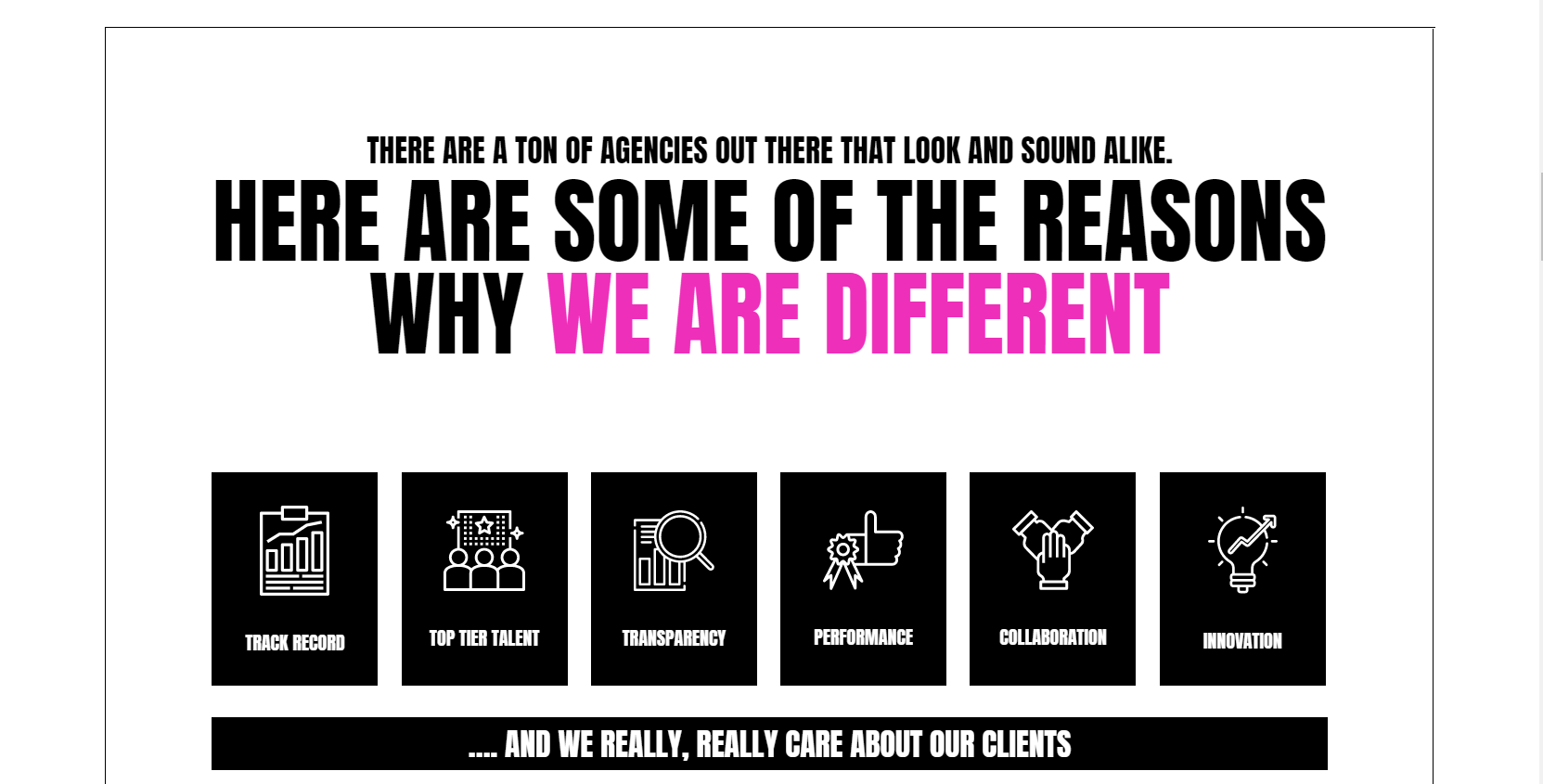
Mint’s aesthetic is clean and simple; there is good use of copy versus space, and the pink in the logo pops. The color scheme and polka dots remind me a little of the 80’s. While it doesn’t feel like a super new site, I also wouldn’t describe the layout as old. The positioning doesn’t feel very new or unique. For example, in trying to convey their difference (image below), it would go further if these points of differentiation were associated with statements and performance data rather than icons. Don’t just tell me you are different; prove it.
While the photo quality is above average (still stock images, but they have more of an artsy feel to them), some of the image choices seem random (see screenshot below). It’s always preferable to have images of the actual team rather than stock images, if possible. That makes an agency feel less anonymous, which is helpful in the pursuit of new agency-client relationships.

Mint’s capabilities are built into the homepage when you scroll down. I don’t see any examples of work or results, giving a sense of ambiguity about what they do, how they do it, and why a prospect should trust them with their business. Leaving their site, I still have no idea who Mint is.
Jacob Tyler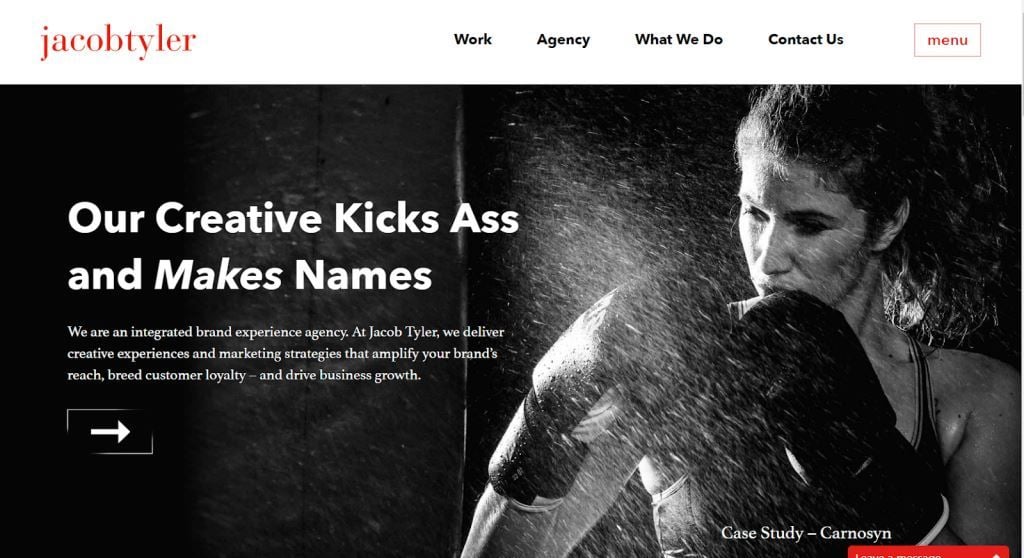
- Score from Google’s PageSpeed Insights (mobile): 43/100
- Score from Google’s PageSpeed Insights (desktop): 88/100
Jacob Tyler’s homepage features clean and clear copy, as well as a good balance of copy and space. The billboard image (apparently from a case study, and not a stock photo) makes good use of the person’s gaze directed towards the positioning statement. Their homepage does a great job of demonstrating their work and results.
This layout reminds me of something else that Christopher Butler of Newfangled wrote in his discussion of agency homepages. He presented two examples of agency homepages, predicting that one would be “likely to attract, inform, and engage future clients far more effectively than the other.” And the reason why one would be less effective was that one of the agencies chose to prioritize their work over their positioning. To be fair, Jacob Tyler’s positioning is still front and center above the fold, but I wonder if their homepage layout doesn’t come at an unseen cost.
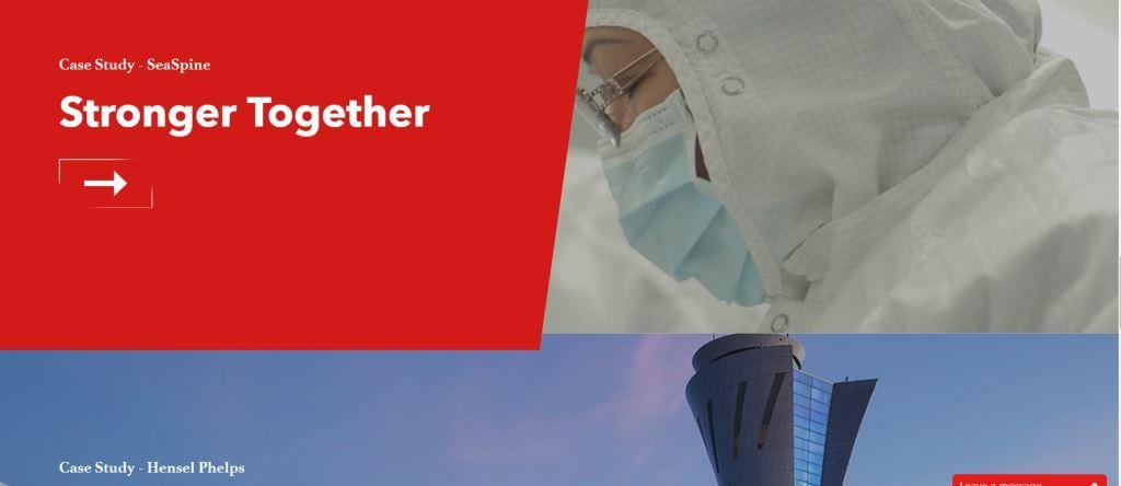
Anyone who knows me knows I constantly beat the “show your results” drum. However, I’m not sure if there is a benefit to having examples of work on the homepage instead of a page devoted to “Our Work.” I think Christopher makes a valid point when he says that this approach causes a visitor to learn more about an agency’s clients than about the agency. Ideally, an agency’s homepage should help a prospect determine whether the agency serves a business like theirs.
Other observations about Jacob Tyler’s website include that their message pop-up module is unobtrusive and complementary to the site design. The navigation is straightforward, without visible surprises.
Caava Design
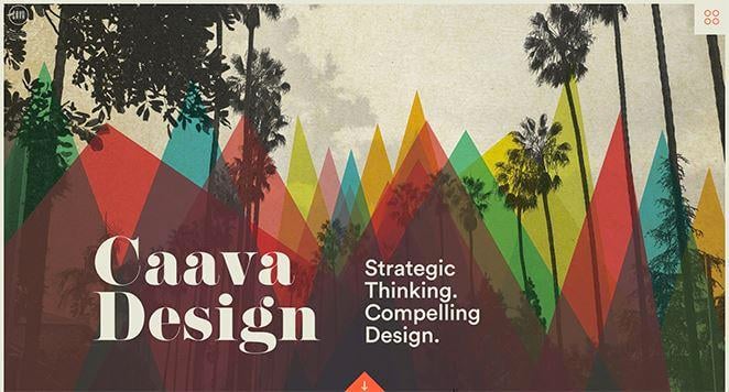
- Score from Google’s PageSpeed Insights (mobile): 63/100
- Score from Google’s PageSpeed Insights (desktop): 97/100
Based on first impression, I like this homepage. Just looking at their page speed score and aesthetic, Caava seems to have nailed the balance of beauty and functionality. Their navigation menu is different enough to seem new, but not so much so that it deviates into something weird and “non-standard.” (Remember, according to Google, that would not be considered beautiful).
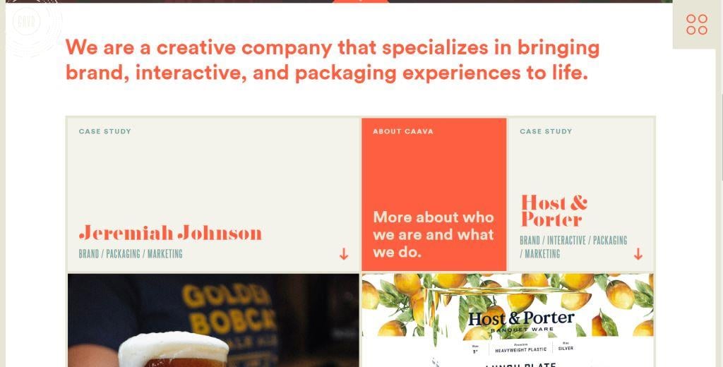
Like Jacob Tyler, Caava features case studies on their homepage, but I think with very different results. The way Caava has laid out their case studies is more supportive of their own branding in the look and feel (color and fonts). Additionally, mixed in among the patchwork of case studies, Caava has included content blocks about themselves. Each block can be clicked through for additional information, and as a whole, the grid seems more consistent and representative of who Caava is. When I look at this, I feel like I get a sense of Caava (including what they do and who they do it for), not just their clients.
Parting thoughts
Based on this quick look, agency homepages run the gamut in terms of design and effectiveness. The question is: why aren’t agency homepages setting the standard for homepages across industries? By all rights, they should be. More agencies should be knocking website design out of the park—if nothing else, because most of them redesign their sites more often than businesses in other industries.
When agencies fall short on website design, I suspect it may be for the same reason that agencies’ positioning is often a bit off-the-mark: perspective. Agencies are too close and tend to be blind to potential shortcomings when it comes to positioning their agency. This isn’t a knock on agencies’ talent or capabilities; it’s more about having the ability to read a label when you’re inside of the jar (it's impossible). Even if your agency delivers top-shelf creative services to clients, you could still miss the mark when providing the same services to yourself.
What do you think? Are expectations for agency websites too high? Do you feel that most agency homepages do currently set the bar for all industries? Take a look at your agency’s homepage. How would you rank it on the elements discussed here? How does it rate from a new business standpoint? Does it provide what a new prospective client would be looking for? I’d love to hear your thoughts.
How does your agency look to prospects? Get expert feedback:

Read more:
- What You Need to Know About Good Agency “About Us” Pages
- Why You Should Consider Lead-Gen Tactics for Your Agency Website
- Getting Found: The Fight for Agency New Business Starts At Search
- How Agencies Can Effectively Present Case Studies for New Business
- Analyzing Agencies in 3 Hot Niches: A New Business Perspective
- 6 Agencies Taking An Off-the-Beaten-Path Approach To Their Business
- What You Need To Know About Agency Taglines
Image credits: agency homepages © Rawpixel.com/Adobe Stock; agency homepage design © tanyabosyk/Adobe Stock; well-designed agency homepages © Chaosamran_Studio; best agency website © bongkam/Adobe Stock; mobile friendliness agency homepage © Daniel Berkmann/Adobe Stock.
